
Messages that stay clear — even across languages.
A premium translation chat is not only about converting text — it’s about reducing misunderstandings. 6chatting’s dual-language bubbles are designed so users can instantly see what was translated, the translation direction, and the status of the translation without cluttering the conversation.
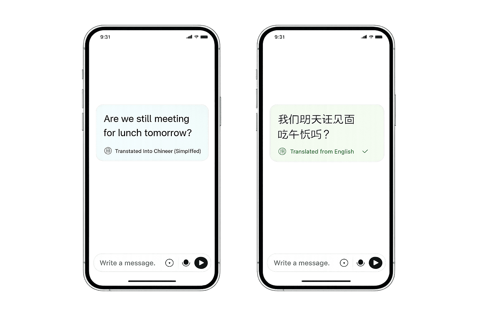
The goal is simple: users should never feel confused about what language they are reading, or what was translated.
Why bubble design matters in translated chat
Most translation apps fail at UX: users don’t know what changed, what direction it went, or whether the message is final. 6chatting fixes that.
Users can immediately recognize what is translated and what is original, reducing misinterpretation and wrong assumptions.
Status indicators show when translation is processing vs complete, so users don’t think the app ‘changed’ messages unexpectedly.
Clarity matters in pricing, logistics, and agreements. Bubble UX reduces errors that cost money and reputation.
What users see in the chat
These are the core elements that make dual-language bubbles feel premium.
Users can see which language a message started in and what it was translated into. Direction clarity prevents misreading and helps both sides stay aligned.
- Clear source → target direction
- Consistent placement in the bubble UI
- Works the same across mobile and desktop
The UI communicates whether a message is translating or fully translated. This reduces confusion during poor network conditions or high traffic.
- Translating / translated indicators
- Reliable, predictable feedback
- Designed to avoid ‘ghost edits’ perception
Premium chat bubbles must stay clean. The layout avoids clutter, keeps spacing consistent, and improves long-message readability.
- Balanced spacing for long text
- Typography tuned for speed-reading
- Minimal visual noise
The system prioritizes keeping the intent clear. Users shouldn’t need to ‘decode’ what the translation meant—especially in high-stakes conversations.
- Clarity over literal word-by-word output
- Better interpretation of tone
- Works well for casual and professional chats
Premium UX principles behind the bubbles
This is what separates a premium translation chat experience from a basic translator pasted into a messenger.
Users get the same bubble logic on every device. No surprises when switching from phone to desktop.
The app never hides what it did. Direction + status always remain visible, so users trust the output.
The UI is designed to keep momentum. The user should focus on the conversation, not the translation mechanics.
Best use cases for dual-language bubbles
Anywhere misunderstandings are expensive, dual-language clarity becomes a competitive advantage.
Agents and customers stay aligned on details, refunds, and policies across languages.
Negotiations, delivery instructions, and product specs remain clearer and less error-prone.
Users can express themselves naturally while the app handles translation smoothly.
Language support, verification ticks, and voice translation work together to create a complete premium experience.